As The Queen Is Dead approaches its 40th anniversary, countless articles will once again celebrate the album as one of the defining records of the 1980s. Yet, I would like to take this opportunity to expand beyond the sole focus of the music. Let’s look back at another crucial part of The Smiths’ identity: their imagery.
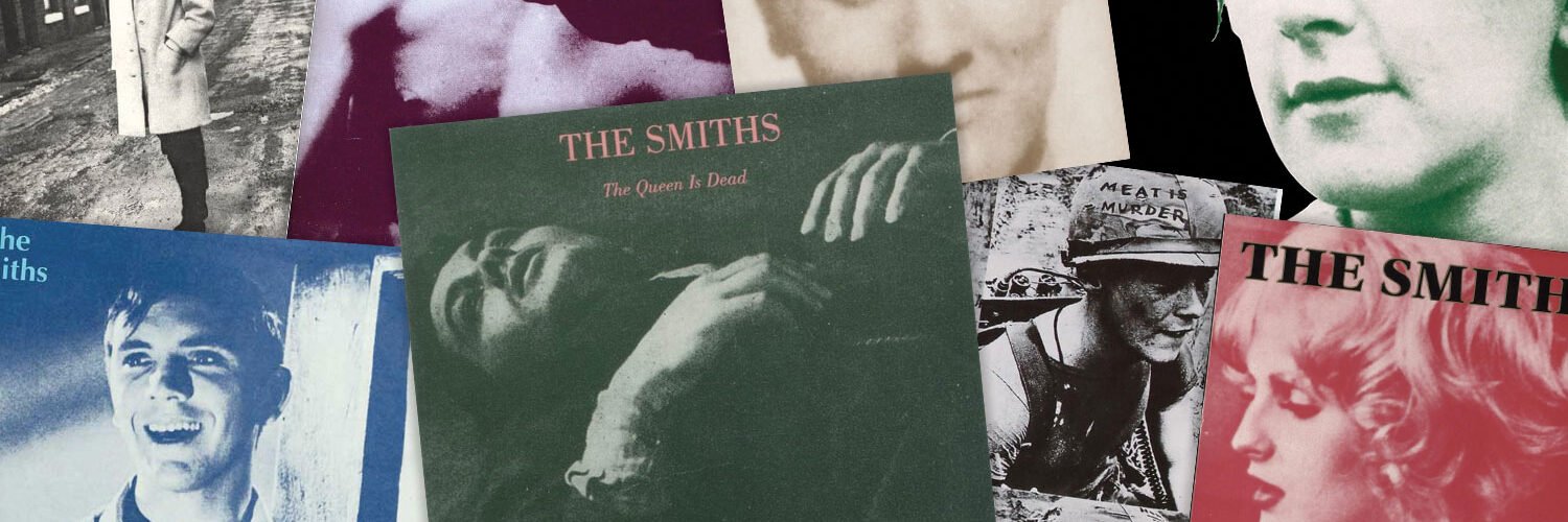
When it came to record sleeves, The Smiths developed a visual language that would become one of their defining trademarks. While most of their contemporaries appeared on magazine covers and record sleeves adorned with carefully staged publicity photographs, The Smiths largely chose a different path. Their record covers featured monochrome portraits —never their own— tinted in striking colours. Rather than place themselves at the centre, The Smiths chose to populate their sleeves with the faces of others.
The Faces of Others
Fans who pick up a Smiths record are welcomed into a carefully curated landscape of kitchen-sink dramas, French cinema, literature, television and pop culture. These photographs were meticulously curated by Morrissey, working closely with Rough Trade art coordinator Jo Slee.
The precise reasoning behind many of these choices remains elusive. Some images clearly held personal significance. However, others appear to have been selected simply because Morrissey found them visually compelling. As he would later admit: “It was often down to a certain degree of bluff on my part and sometimes I would have to bend the truth about certain bits of artwork and what they meant”.
The Smiths were constructing an aesthetic of their own, one rooted in everyday Britain and in the cultural figures that had shaped Morrissey’s imagination. The band’s heroes were not limited to musicians. They included playwrights, actors, film stars, soap-opera personalities, writers and outsiders of every description. Distinctions between high and low culture simply did not seem to matter.
Ordinariness as an Instrument of Power
This eclectic cast of characters became an integral part of the Smiths experience. They appeared on album sleeves and single covers, surfaced in lyrics or sampled in the background of a track, and later found their way into concert backdrops and projections. Morrissey would later explain that “it came from an idea [he] had to take images that were the opposite of glamour and to pump enough heart and desire into them to show ordinariness as an instrument of power – or, possibly, glamour.”
While many of their contemporaries embraced the glamour of the MTV era, The Smiths cultivated this “powerful ordinariness”, starting with their own name. They didn’t really fit in any box. They were not goths, not glam, and even though they could fit the New-Romantic trend musically and lyrically, they didn’t look the part. There were no extravagant costumes, no elaborate make-up, no attempts at rock-star excess. Morrissey appeared on stage wearing NHS-style spectacles, hearing aids in solidarity with a fan who was self-conscious about wearing one, and shirts or cardigans that looked more likely to have come from a local charity shop than a fashion boutique.
A Gallery of Heroes
Looking back through the band’s artwork today reveals far more than a collection of striking sleeve designs. It offers a map of Morrissey’s influences and obsessions, introducing listeners to a peculiar but compelling gallery of heroes, anti-heroes and forgotten icons. Forty years after The Queen Is Dead, that gallery remains every bit as fascinating as the music that first brought it to life.
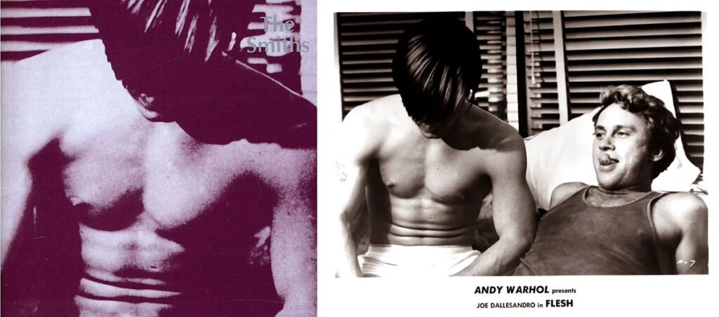
Joe Dallesandro
For their debut album cover, Morrissey selected a still from Andy Warhol’s 1968 film Flesh. The original photograph featured Geraldine Smith reclining beside a shirtless Joe Dallesandro. For the album sleeve, the image was cropped to focus almost exclusively on Dallesandro’s torso.
Interestingly, this was not Dallesandro’s first appearance on a famous record sleeve. In 1971, Andy Warhol used a photograph of the actor as the basis for the artwork with the zipper for The Rolling Stones‘ Sticky Fingers. While Dallesandro’s face is absent from the cover, the image’s provocative close-up is widely believed to have been inspired by his physique, further cementing his status as one of pop culture’s unlikely icons.
Marine Corporal Michael Wynn
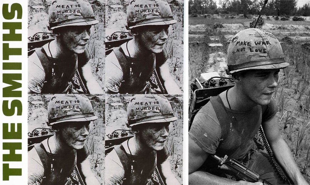
The Smith’s sophomore album is probably one of the most iconic. Here Morrissey selected a portrait of U.S. Marine Cpl Michael Wynn featuring on the poster for Emile De Antonio’s documentary about the Vietnam War: In The Year Of The Pig. The documentary, released in 1968, at the height of the conflict sparked some controversy for its strongly anti-war stance. De Antonio famously quipped: “Only God is objective, and he doesn’t make films.”
In the original image, Wynn’s helmet bears the slogan “Make War Not Love”, a cynical twist on the counterculture mantra “Make Love Not War”. For the album sleeve, Morrissey altered the text to read “Meat Is Murder”, extending on the album’s central theme. Unlike many Smiths sleeves, the message here is unmistakable.
The alteration was made without Wynn’s knowledge or permission. He later remembered: “I first learned of it when my sister happened to see the album while she was shopping. I wasn’t real happy about The Smiths changing the wording.”
Alain Delon
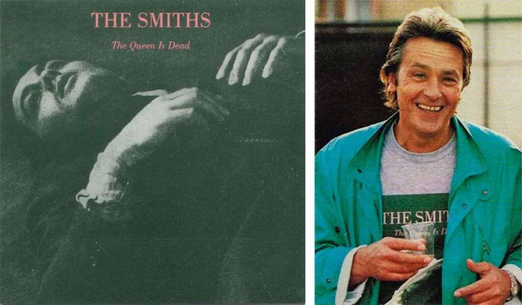
The Smith’s masterpiece, The Queen Is Dead, features a still of Alain Delon in Alain Cavalier‘s 1964 noir movie L’Insoumis (or The Unvanquished). The actor plays a deserter of the French Foreign Legion during Algeria’s 1961 uprising. The image selected for the album is a still of the final scene where Delon’s character is lying on the floor, dying.
Famously, Alain Delon wrote to the band to give them permission to use his image. He added: “I told them my parents were upset that anyone would call an album The Queen is Dead.” Any reservations, however, appear to have been short-lived. Delon was later photographed wearing a promotional T-shirt for the album, becoming an ambassador for one of the defining records of the 1980s.
Richard Davalos
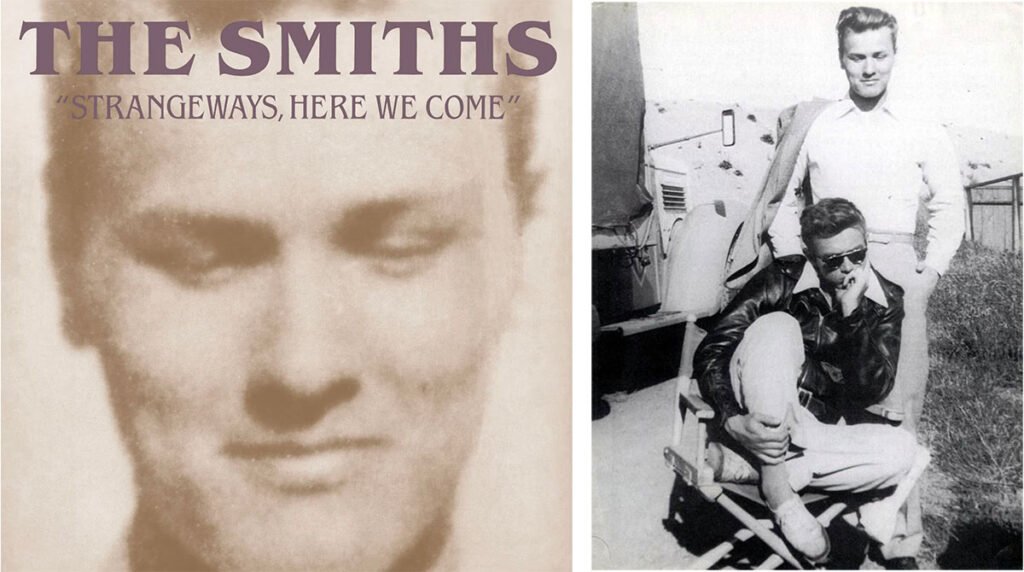
Initially, for the band’s last album, Morrissey envisioned using a picture of Harvey Keitel in the 1967 film, Who’s That Knocking At My Door, but the actor refused. So the singer had to find different idea. As an eternal James Dean admirer, he went back to the 1955 movie East of Eden. He stopped on a photograph taken on the set of the movie. It featured the star, seating and pensive, with his co-star Richard Davalos standing behind and looking down at him.
If Harvey Keitel wasn’t too familiar with the Smith, Richard Davalos was. And he was a fan. During the band’s 1986 American tour, he visited backstage to meet Morrissey. Recalling the encounter in his autobiography, Morrissey described how the actor approached him and, before saying a word, slipped a square-faced silver ring onto his finger. The two would remain friends thereafter.
So, when the time came to choose the artwork for Strangeways, Here We Come, Morrissey made a surprising decision. Rather than focus on his idol James Dean, he cropped the image to centre on Richard Davalos. It was a fitting gesture: elevating a figure who stood just outside the spotlight and placing him at the forefront of the band’s final album.
Shelagh Delaney
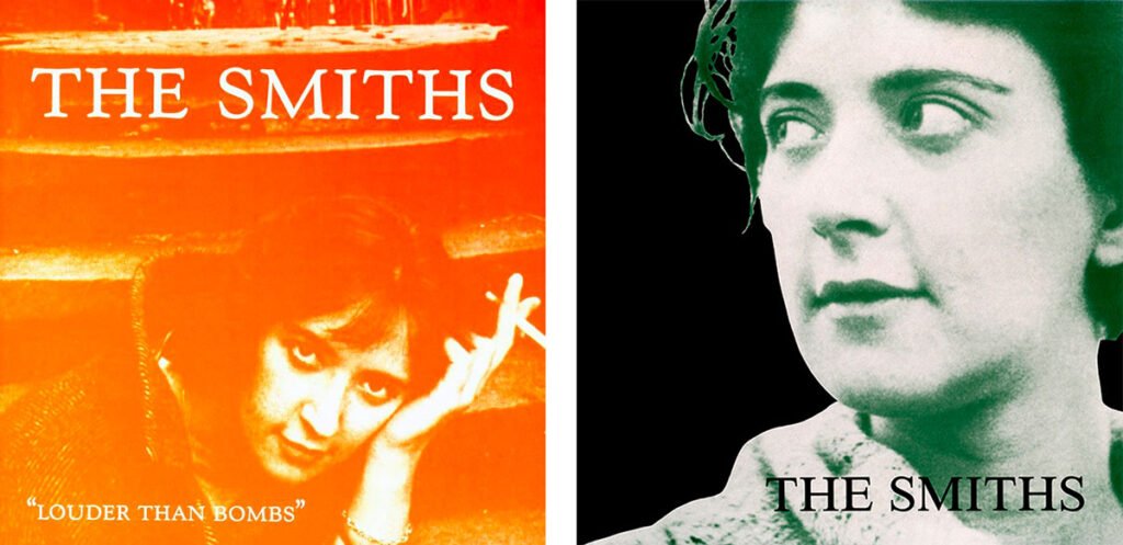
Few figures exerted a greater influence on Morrissey than playwright Shelagh Delaney. “I’ve never made any secret of the fact that at least 50 per cent of my reason for writing can be blamed on Shelagh Delaney”, he admitted. He even borrowed a few lines from her play A Taste of Honey for the song “Reel Around The Fontain”: “I dreamt about you last night/ And I fell out of bed twice”.
It was only logical then, that he chose to use portraits of the lady, not once but twice to feature on two records sleeves: the single “Girlfriend In A Coma”, and the compilation Louder Than Bombs.
Terrence Stamp
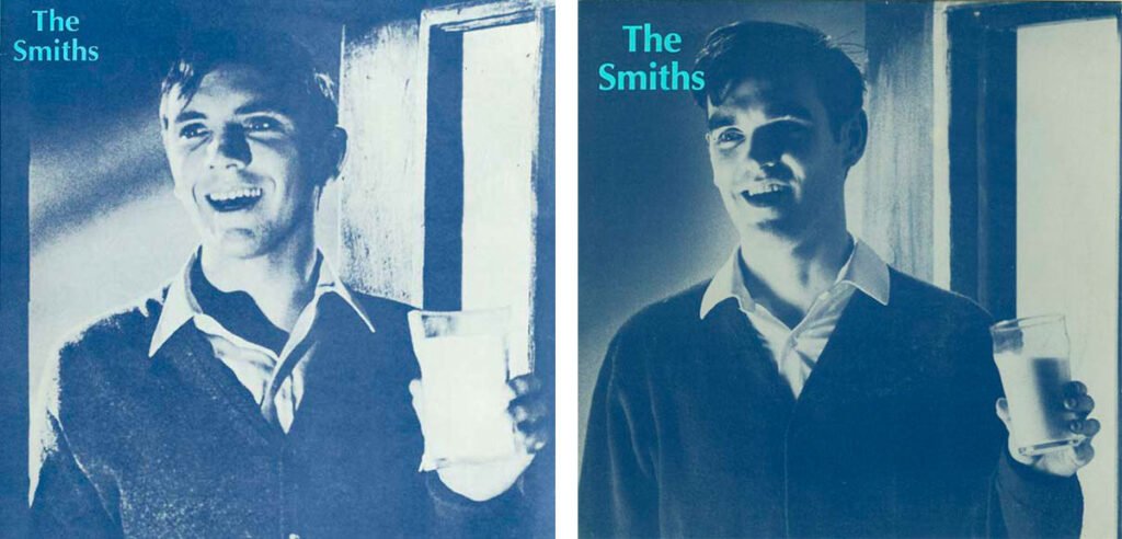
Most of the time, when permission to use a photograph was denied, Morrissey simply moved on and selected another image. The artwork for “What Difference Does It Make?“, however, proved to be a rare exception.
The original sleeve featured a still of Terence Stamp from the 1965 movie The Collector. In the photograph, the actor is seen holding a chloroform-soaked cloth. By the time Stamp objected to the use of his image, however, the single had already been released. Rather than abandon the concept altogether, Morrissey decided to recreate the photograph himself. Mimicking Stamp’s pose, he appeared on an alternative sleeve holding a glass of milk in place of the chloroform pad.
The dispute was ultimately short-lived. Stamp eventually granted permission for the use of the original image, allowing the sleeve to be reinstated. Yet the episode remains one of the clearest examples of how seriously Morrissey regarded The Smiths’ visual identity.
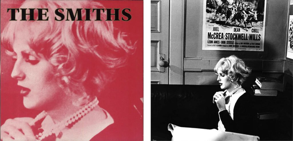
Candy Darling
Another fascinating figure in Morrissey’s cultural universe was Candy Darling. The transgender actress was one of Andy Warhol’s most celebrated “superstars.” A fixture of New York’s underground art scene in the late 1960s and early 1970s, Darling appeared in several Warhol films. She became a symbol of glamour and transgender identity.
Candy Darling embodied the kind of misunderstood and unconventional figure that frequently populated Morrissey’s gallery of heroes. Her image was used for the sleeve of “Sheila Take a Bow,” taken from a promotional still for the 1971 film Women in Revolt. Like Joe Dallesandro, Darling belonged to the Factory circle that fascinated Morrissey, introducing another strand of underground cinema into The Smiths’ visual mythology.
Viv Nicholson
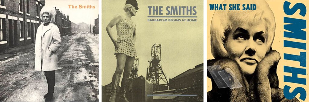
Few figures better illustrate Morrissey’s fascination with ordinary people elevated to iconic status than Viv Nicholson. The Yorkshire housewife became a national celebrity in 1961 after winning the football pools and famously declaring that she would “spend, spend, spend.” Her turbulent life turned her into a uniquely British cultural figure.
Morrissey’s admiration ran deep. He even borrowed a line from Nicholson’s autobiography for “Still Ill“: “Under the iron bridge we kissed…” Her image appeared on three Smiths sleeves: “Heaven Knows I’m Miserable Now”, “What She Said” and “Barbarism Begins at Home“. A fourth appearance on “The Headmaster Ritual” was planned, but Nicholson, by then a Jehovah’s Witness, objected to the song’s lyrics and declined permission.
That Morrissey returned to Nicholson time and again is revealing. Unlike Alain Delon or Terence Stamp, she was not a film star. Unlike Shelagh Delaney, she was not a celebrated writer. Yet in the Smiths’ universe, she occupied an equally important place. Viv Nicholson embodied the idea that glamour could be found in the most unexpected places—a philosophy that lay at the heart of The Smiths’ imagery from the very beginning.