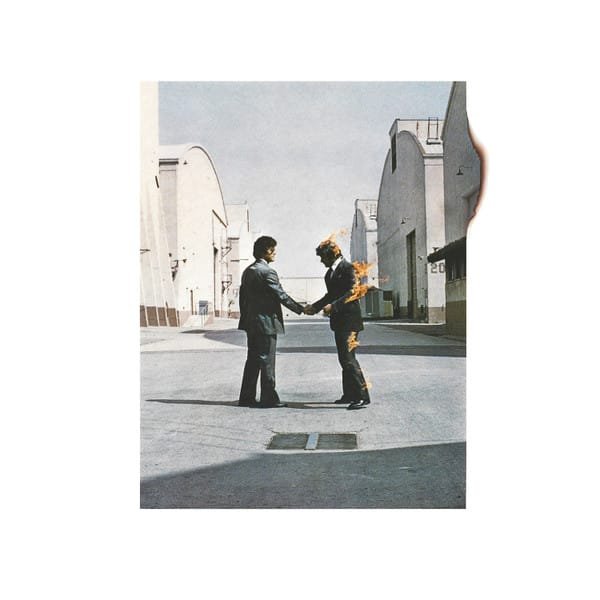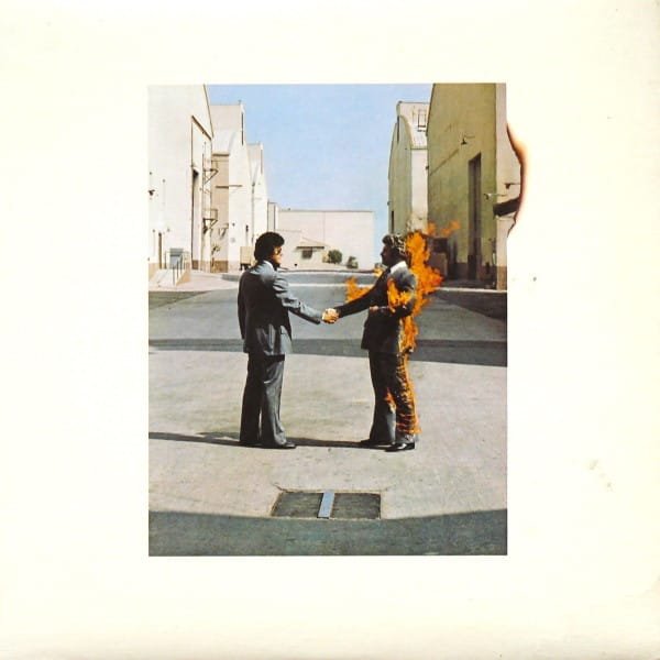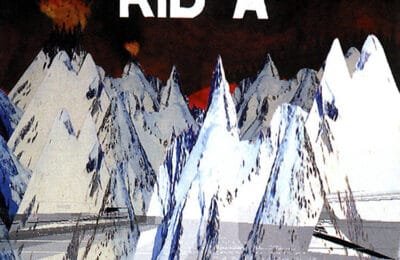
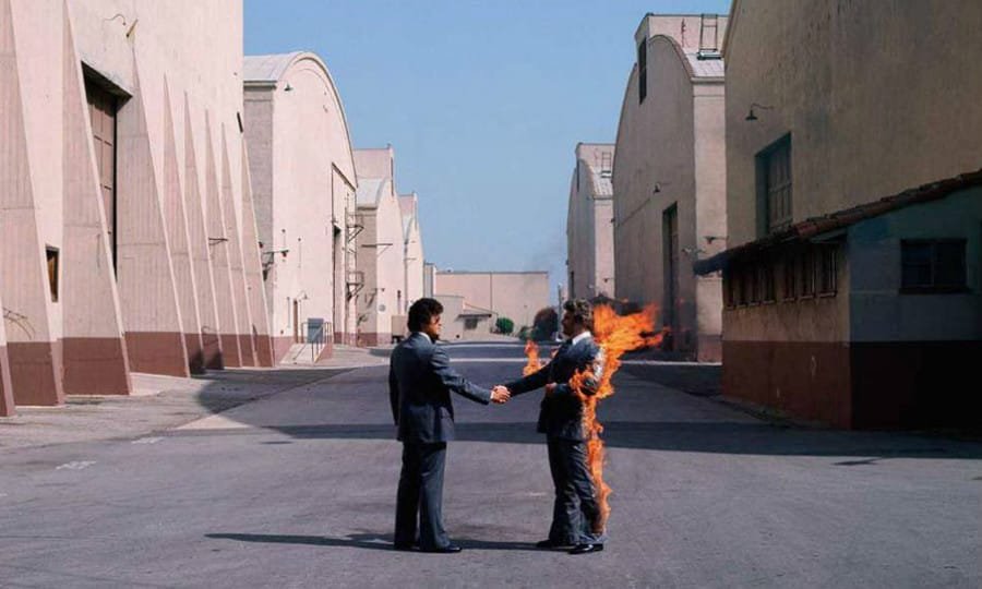
On September 12, 1975, Pink Floyd fans rushed in the stores to get their copies of Wish You Were Here, the band’s new album. They found a mysterious package, wrapped in a black plastic shrink cover, with only a round label featuring a robotic handshake. Some too eager to get to the interesting part — the music— sadly ripped it off. They discovered a photo of another handshake between two businessmen, one of them being literally on fire. Once again, Pink Floyd had nailed another iconic artwork cover. And that black shrink was masking much more than just an album. Let’s dive into it.
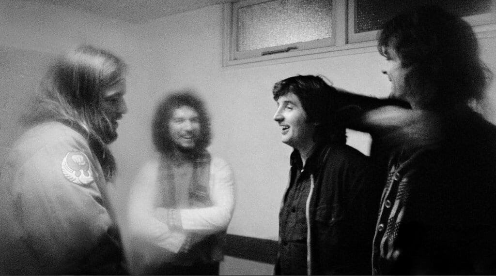
David Gilmour, Aubrey Powell, Storm Thorgerson and Rick Wright – 1973
Pink Floyd and Hipgnosis: more than a collaboration
As usual, Pink Floyd called for their long-lasting partners from Hipgnosis to realise the package of their new album. This creative collaboration started with the band’s second album, A Saucerful of Secret, in 1968. The band came to their friends Storm Thorgerson and Aubrey ‘Po’ Powell, who were also Syd Barrett’s roommates. This was their first album cover creation, and the start of a design agency that would become as legendary as the bands they worked with. They went on creating covers for Syd Barrett’s solo albums, The Pretty Things, Humble Pie, or T-Rex. The creation of the iconic cover for The Dark Side Of The Moon propelled them to another level. It opened the doors to collaboration with the likes of Led Zepplin, Wings or AC/DC.
Hiring them to create the artwork around Wish You Were Here was not really a choice. It was simply obvious. Storm Thorgerson hanged with Pink Floyd during their 1974 tour, and regularly visited them in the studio. He was fully aware of the content of the album, and the full meaning of the concept behind it, for talking it over in details with the band. Wish You Were Here was exploring the emptiness left by the absence of Syd Barrett. And deeper, it was a critique of the music business causing a growing sense of alienation.
From Concept to Vision
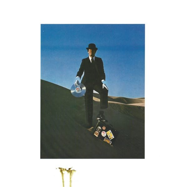
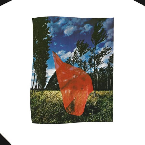
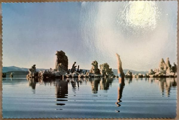
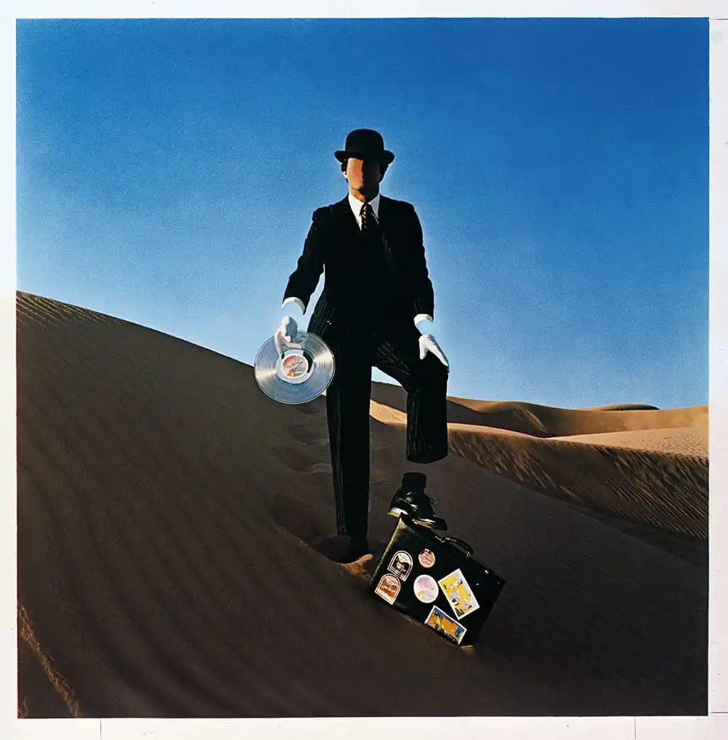
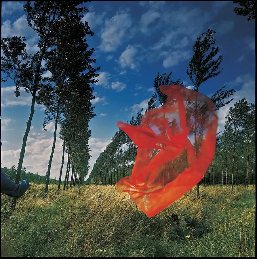
Storm and Po discussed it together, explored different possibilities, turned concept into sketches… The duo came up with an idea of a pair of business men —record industry executives as suggested in “Have A Cigar”— shaking hands to seal some shady deal, that would leave one of them burnt. They also imagined a faceless sales man handing out records in the desert, underlaying the idea of him selling his soul and being an empty suit. Finally, they envisioned a man diving in a still lake, with no ripples. It was meant to represent the band dealing with all the nonsense of the industry, and state that any artist has the power to create as many — or few— waves as they see fit. When Storm unveiled the plan to the band, managers, engineers and other people in the Abbey Road studio, he received an enthusiastic round of applause.
The plan was promising. Now the difficult part was to execute it. In the 1970s, there was no computers to digitally alter photos. The artists were used to manipulate dyes, bleach, acetic acid and many other darkroom tricks to touch up the photographs and come up with the result they envisioned. Hipgnosis also specialised in planning designs out of this world and making it as real as possible to take a picture, before doing the touch ups. Which is simple enough for the faceless man, or a floating red scarf… But how do you go about a man on fire ? Powell remembers asking the question to Storm. He replied: « I guess you’re going to have to burn a man for real. »
How Do You Burn a Man?
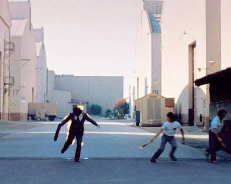
What a better place to do this than in a movie studio in California, where stuntmen do this for a living? As Pink Floyd was touring in the US, Hipgnosis followed them. They secured a location to take the pictures in the Warner Bros. studio complex in Burbank, and recruited experts Ronnie Rondell and Danny Rogers Jr.
However, when he was shown the concept sketches, Rondell —the Flaming Man— warned the designers: « I never stand still to do a fire stunt. You have to be moving to keep the fire behind you… running, jumping or whatever. » The picture is of two men shaking hands, which implies staying still for a moment. The designers insisted. The stuntman gave no guarantee, indicating he would try to do it running. As they couldn’t afford to loose him, they agreed, prepared to wing it on the moment.
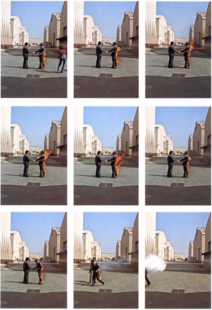
Playing with fire… for art
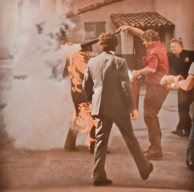
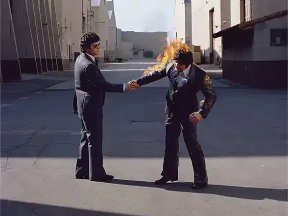
Rondell came prepared with his team on the day. He was wearing a fireproof wig and a neck protector, and was covered with petrol. His team was standing ready with fire extinguishers and blankets. Three photographers —including Powell, his assistant Peter Christopherson and Jeff Smith— were positioned to shoot every thing as soon as he was lit on fire. They first tried to get the right shot with him running toward the camera, but it didn’t really work as they wanted it. Later in the day, as there was no wind, Powell approached the stuntman: « I really have to have you shaking hands. There’s no wind, it’s still. » Ronnie said, « Okay. We’ll try it. »
So they set up to proceed with this very risky operation. Every time, the fire was out in 20 seconds, so the photographers were snapping all they could with different settings. After the first attempt, Rondell wasn’t too happy and wanted another go —sure he could do better. The third time, a light gust of wind blew the fire around his face, and he threw himself to the ground. His team was immediately on top of the situation with extenguishers and blankets. Rondell was lucky. It only burnt his eyebrows and singed his moustache. But that was it. The man said « No more ». That was enough. The iconic shot had been immortalised.

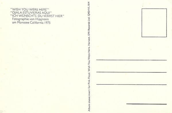
The Still Diver at Mono Lake
The other tricky shot was the one at Mono Lake, with the still diver. Anyone knows diving in water makes a big splash, and ripples over the surface will take a while to dissipate. Getting the right shot, with no ripples, and a perfect reflection on the surface of the lake was the tricky part. To do so, the diver had to stand still in a yoga position, in a chair locked in the mud, immersed in water to his waist… He had a breathing apparatus, but had to hold his breath to avoid ANY bubbles. For two minutes… Enough for ripples to die down. No darkroom trickery was used on that shot, other than minor touch ups.
A Complete Work of Art
The final product was impressive. The handshake with the Flaming Man was on the front cover, centered in a white frame. The top right corner of the frame is burned out, showing more of the photo, breaking the frame and pulling the viewer in. On the back cover figures the shot of the faceless man in the desert, with is briefcase, and empty suit, handing out a transparent record. The shot was also framed in a white background, that appears to be torn in the bottom left, letting some sand spill over. The inner sleeve figured a photo of a floating red scarf, with a nude model barely visible behind it, symbolising the absence. And finally, the Mono Lake picture was printed on a postcard inside.
Very impressive, and already iconic, I must say. But that wasn’t enough for Storm Thorgerson. Inspired by Roxy Music’s album Country Life, released with a green shrink wrap that was party masking the cover, he wanted to re-inforce the idea of absence. And had more mystery. This didn’t do well with the American record company, Columbia, who rejected the idea completely. But they were overruled. The artists’ choice prevailed. A nice way to highlight the idea behind the album regarding the alienating music industry.
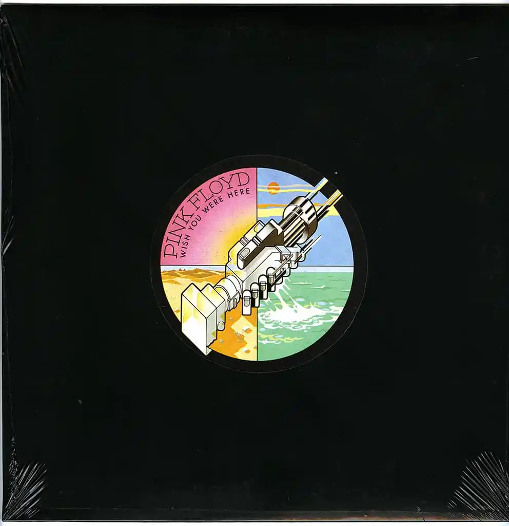
The icing on the cake
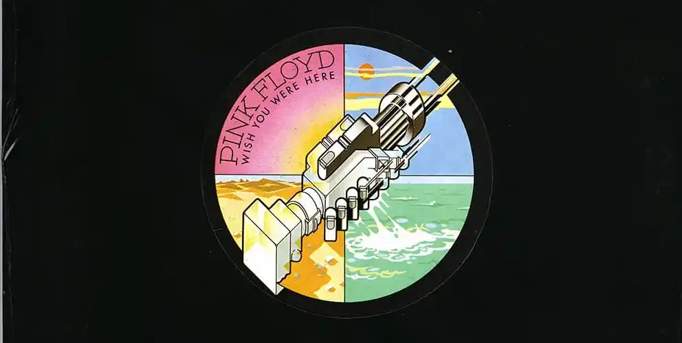
On the shrink wrap figured a simple sticker, designed by George Hardie, one of Hipgnosis designers, responsible for the famous Prism of Dark Side of The Moon. It represents a mechanical handshake —a wink to “Welcome To The Machine”— over a background representing the four elements, as teaser for the cover inside. The Flaming Man handshake obviously represents Fire, the Faceless man in the desert: Earth, the Mono Lake still diver: Water, and the floating red scarf: Air.
Some collectors would carefully slit the black shrink to get the record out, without pulling the sleeve out, and never see the actual cover. How more absent can it get? The band was extremely happy with the whole concept. For drummer Nick Mason, the shrink wrap was the icing on the cake: “I suspect we probably enjoyed the shrink-wrapping more for the trouble it caused in the boardroom than its artistic excellence,” he said. “It was obvious that the record company was not familiar with the work of Christo.”
Shine On You…
As Wish You Were Here turns fifty, its artwork feels more alive than ever. The burning handshake, born from real danger and artistic daring, still captures the album’s uneasy truths about absence and alienation. With the recent passing of stuntman Ronnie Rondell, the man who risked the flames for art, this iconic cover becomes not only a symbol of Pink Floyd’s vision, but also a lasting tribute to those who helped make it immortal — from Storm Thorgerson’s relentless imagination, to Rick Wright’s luminous soundscapes, and to Syd Barrett, whose absence haunts every note.